Statistical modelling / Fitting Wood's curve |
||
|
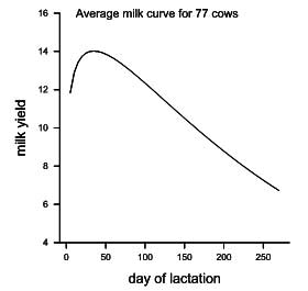
Finally we can use Graphics → Lineplot… (selecting avemilk and nday from the drop-down lists) to produce the graph shown. We see that the average curve has the shape expected with a peak for milk yield at about 6 weeks. The maximum is a little higher than the curve shown in Figure 2 of Romney et al. but this may be due to a slightly different approach to the analysis. We have also not taken into account effects of month of calving and sampling on milk yield. |
|
|
![]()
![]()
![]()